
The Importance of Type
As I began to read for this week’s assignment, a book I had ordered arrived from Amazon. It’s the third edition of John Trimble‘s Writing with Style. If you haven’t used this book, it’s a great one. I had the first version on my bookshelf from 12th-grade English, and when I went to look at it recently, began to wonder about it. A Google search turned up a third edition, and a strong recommendation.
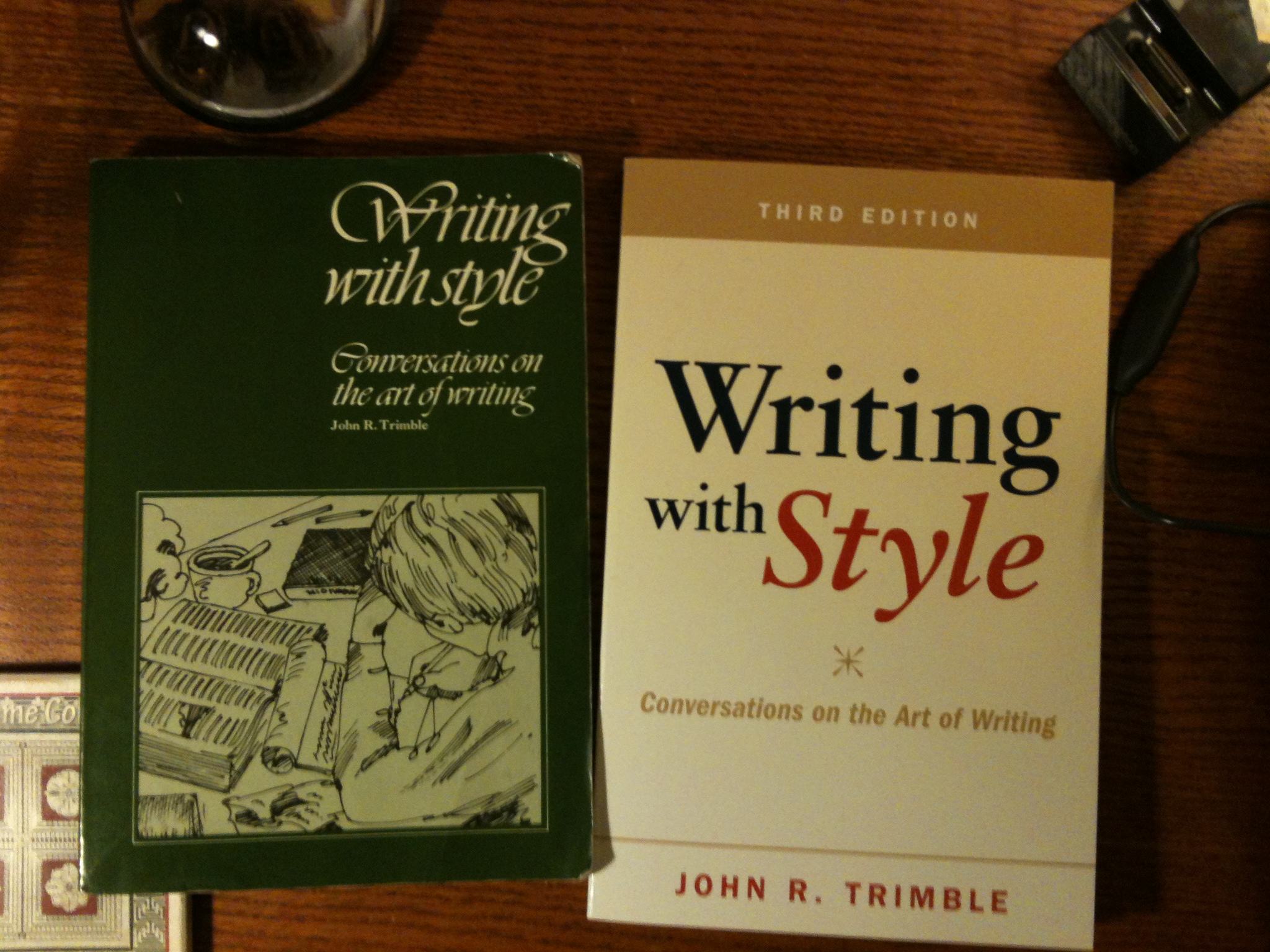
When the book arrived, the first thing I noticed was, of course, the cover–particularly the difference between the covers of the first and third editions. The font difference, especially, was telling. As you can see, the first edition–published in 1975 (and showing a much younger Trimble on the back) uses a calligraphic font, while the third edition uses a serif for the book’s title, and a sans-serif for the subtitle, author, and edition. What particularly struck me, though, was the message that the typefaces sent. Whereas the first edition used the same font face, size, and color for the entire title, the third edition uses changes in color, style, and size to make its point. The word “with” is diminished. Meanwhile, the viewer’s eye is immediately drawn to the word “style.” Not only will this book teach you how to write. Most importantly, it will teach you how to write with style.
I use this example to illustrate the major point of this week’s readings: type, as a component of design (whose general importance was the subject of last week’s post), matters.
Like with design, we as historians must think more about the messages that our fonts convey. This is prevalent in the exhibition world already–would you feel a sense of dissonance from, for example, a Civil War exhibition that uses Helvetica? Just the same, for web work we also need to consider our font, and be willing to play with styles and sizes.
I personally loved the book Thinking with Type, as it helped me, well, think with type; I already noticed its impact on Friday, when I designed a flyer for an upcoming work event. The book presents typographic rules in easy-to-understand terms, and also, as Megan notes, gives some personality to the myriad (the word, not the font) fonts that appear on one’s computer.

As a side note: I couldn’t help but laugh that Thinking with Type cites the sign of the Government Accountability Office, across the street from my office, as committing a “crime of type.” When doing research for the walking tours I lead around that neighborhood, I came across a building that once occupied the block where that criminal sign now sits: the Typographical Temple, home to the Columbia Typographical Union. Appropriate.
Addendum–my comments on classmates’ blogs this week:
Megan (more of a smart-alecky comment)
Lindsey (also smart-alecky)
Stephanie (a bit more serious)
Sheri (ditto)
Claire (also more serious)
Your point about “historians must think more about the messages that our fonts convey” raises the issue of time. When working on research or writing projects, there is always an awareness of time towards completion. Working on a semester schedule means that deadlines are imposed (even if the research could continue). After quite a few semesters working with major project deadlines, a sense of timing is key (and can be learned), but now, a new set of criteria must be added to the “to do” list – namely, considering composition, typography, color, spacing, line height, and many more details of presentation beyond just 11pt or 12 pt font. The question remains as to how adding these criteria affects the balance of time in assembling content and form. It is one thing to be critiqued for content analysis, another to lose credibility for using prime marks instead of curly quotes. Learning by example will help shave off some of the decision time.
[…] have commented on David’s blog post. Share this:TwitterFacebookLike this:LikeBe the first to like this […]
Using Helvetica would totally create a sense of dissonance if used for a project on the Civil War. Ugh. I can’t even imagine how ridiculous that would be.
But I think Sheri is correct. In terms of crafting a dissertation or thesis time is a major factor. For most dissertations and theses it’s probably not necessary to play with form and typeface, but there are instances where it would be appropriate. For example when trying to convey a different concept of time or the construction of narrative is instrumental to your work. In those cases (and others like them) I’d hope that students would be given the necessarily tools, time, and support to play with form. I’d also say that people who consider playing with form are already prepared to do before they write a dissertation or thesis.
[…] David […]
Fully agreed with Geoff’s sentiment there. I definitely think that for most of what we are doing in our non-digital classes, we don’t need to be as worried about the design or the typography. These things are what they are. In the case of books and journal articles, too, a design is someone else’s job–unless we’re doing the new iBooks author feature, Kindle singles, or anything like that–and self-publication doesn’t get one tenure, anyway. But yeah, having more time to be concerned with the form, when form matters, certainly helps!
I found it interesting that you “loved the book Thinking with Type” mostly because I did not… at all. I found that for a book about type that it was incredibly difficult to read. Each page was cluttered with so much crap, crap that often appeared in 10 different type-faces and going in all sorts of directions, that my eyes never knew where to look and I was frequently frustrated. This was especially surprising after Petrik pointed this book out as one to read “from cover to cover” in our syllabus discussion in the first week’s class. As I read the book I kept thinking “read what?”
[…] https://davidmckenzie.info/2012/02/04/the-importance-of-type/#comment-86 […]